
BHFO
UI/UX Redesign, Smart Search, Returns, Product Recommendations
Platforms and Integrations:
See all our Partners


Challenge:
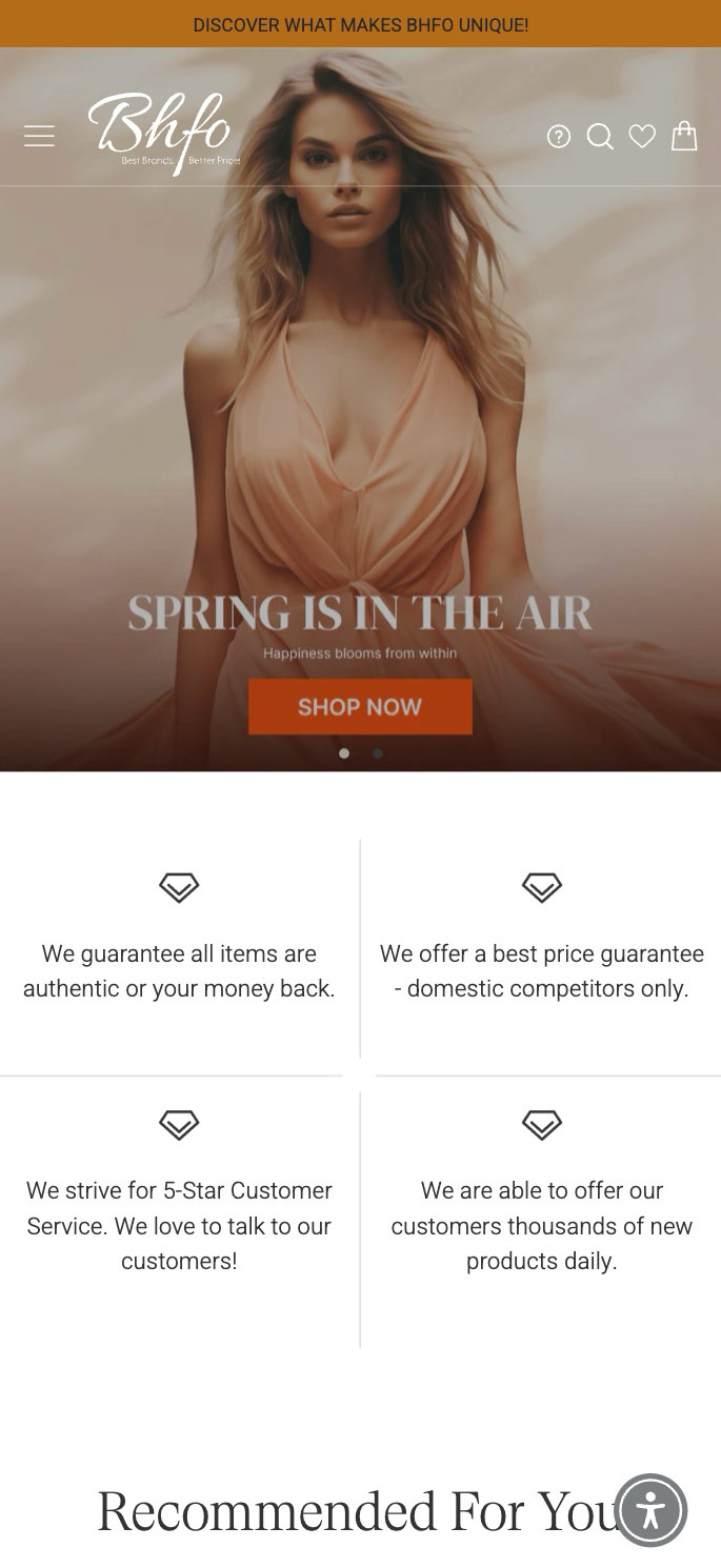
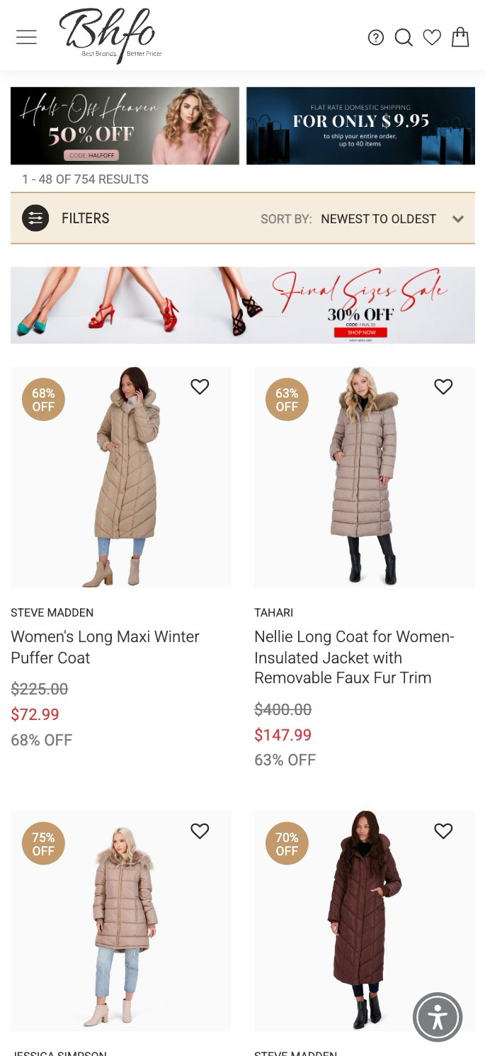
The primary objective was to overhaul the UI/UX of the outdated website to significantly improve the shopping experience, particularly on mobile devices. Given the vast scale of the store's inventory, which sometimes exceeded 1 million SKUs, a robust search solution was essential. We chose Searchspring to power this functionality due to its effectiveness in handling large product volumes.
- Custom UI/UX
- Wishlist
- Smart Search
- Email Automation Flows
- Ajax-based Modules
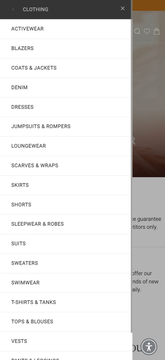
- Mega Menu
- PDP Upsell sections
- PDP Variations Tabs
- Product Recommendations
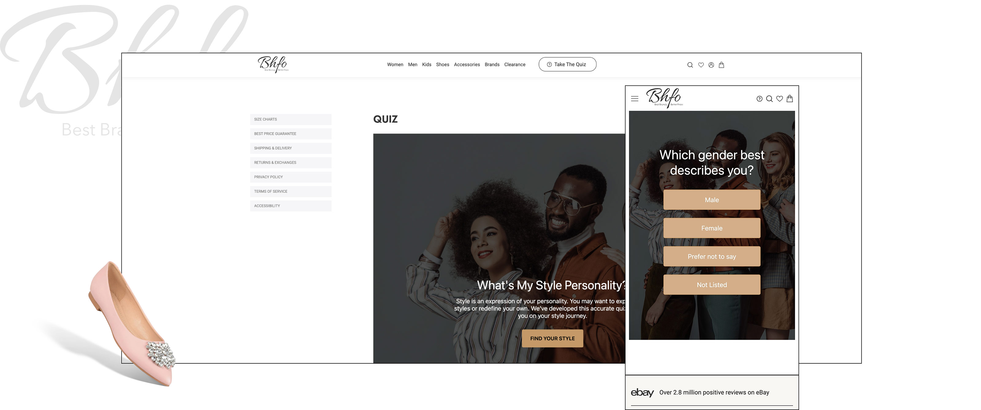
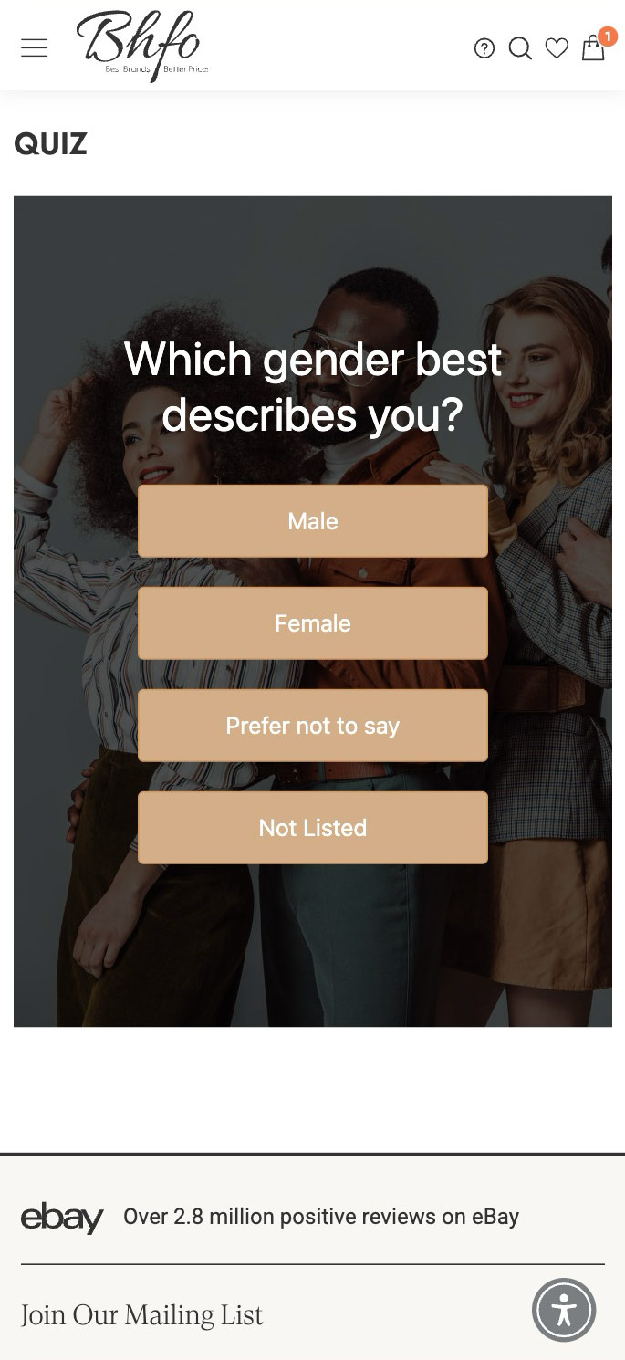
- Product Quiz
Results:
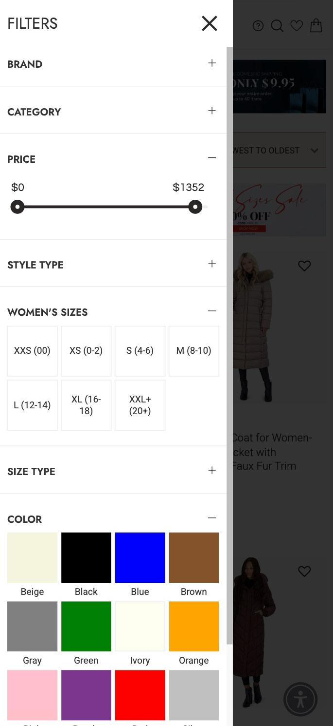
The redesign of the website's UI/UX dramatically enhanced the overall shopping experience, with notable improvements in mobile usability. The implementation of Searchspring as the search solution effectively managed the extensive inventory, ensuring quick and relevant product searches.
The introduction of custom features further enriched user interaction. The Product Wishlist not only simplified the sharing of products but also increased engagement by removing the login barrier. The Collection Pages, powered by Searchspring, provided dynamically curated product listings, improving navigation and discovery. Additionally, the integration of Ajax for "Add to Cart" and "Cart Quantity Update" streamlined the shopping process, making it more efficient and user-friendly. These enhancements collectively contributed to a more seamless and satisfying customer journey.
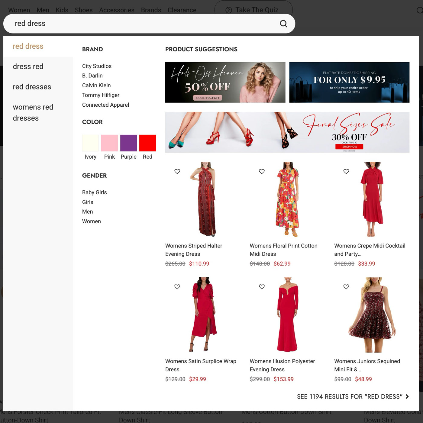
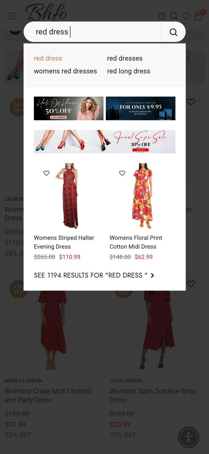
Smart Search
Leveraging a smart search and merchandising, customers find more relevant products on BHFO.com
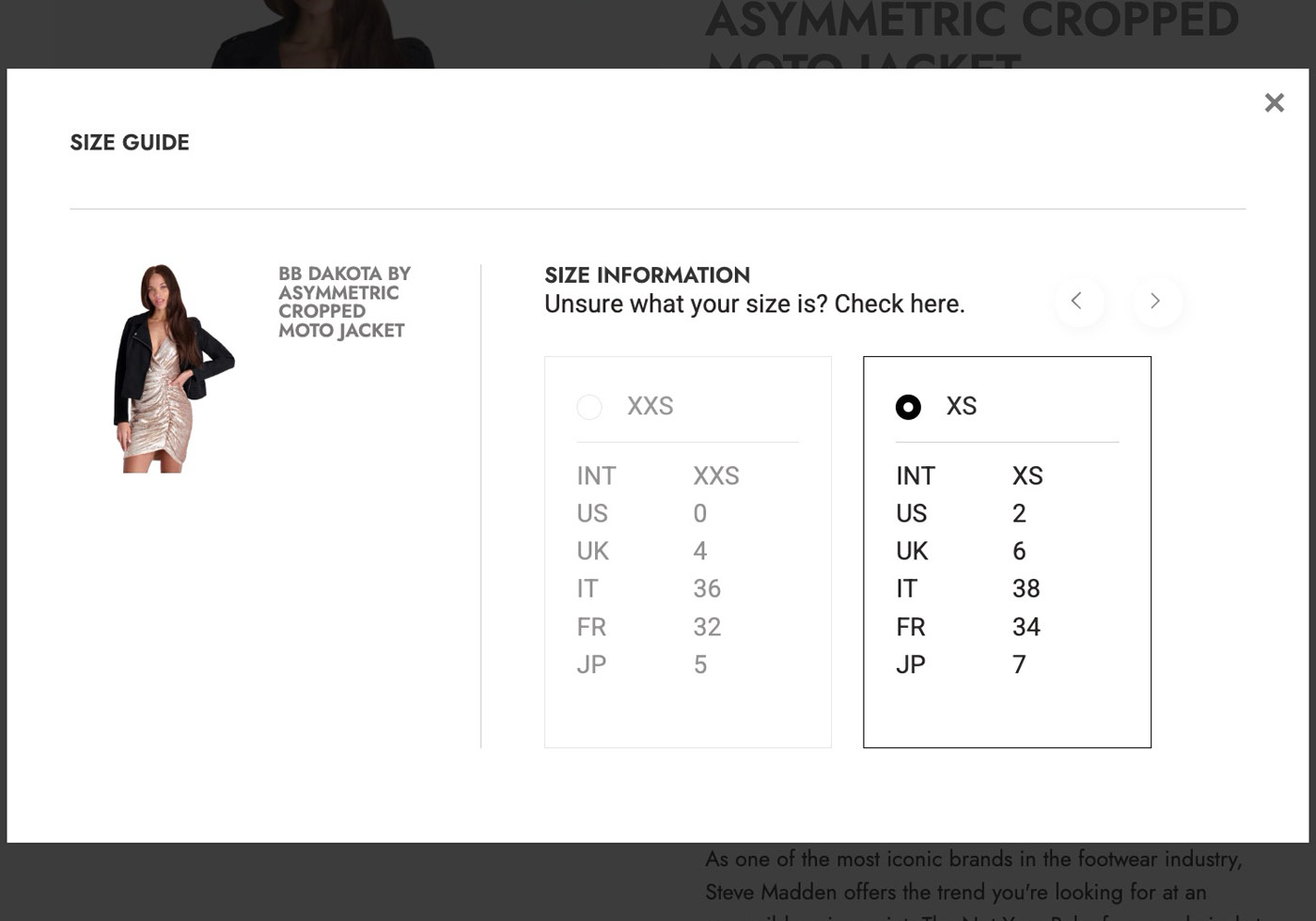
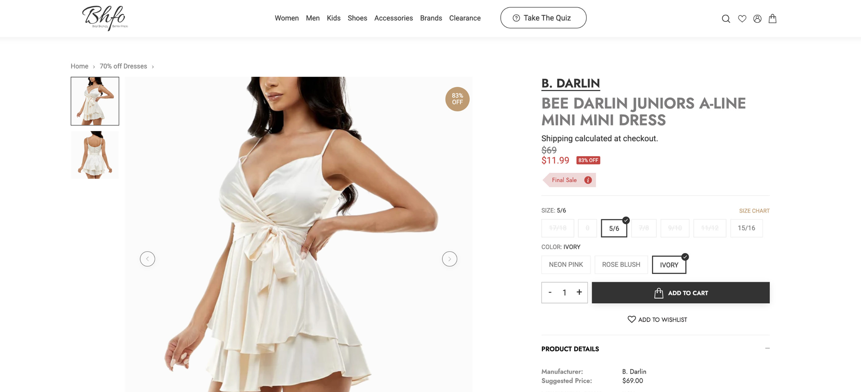
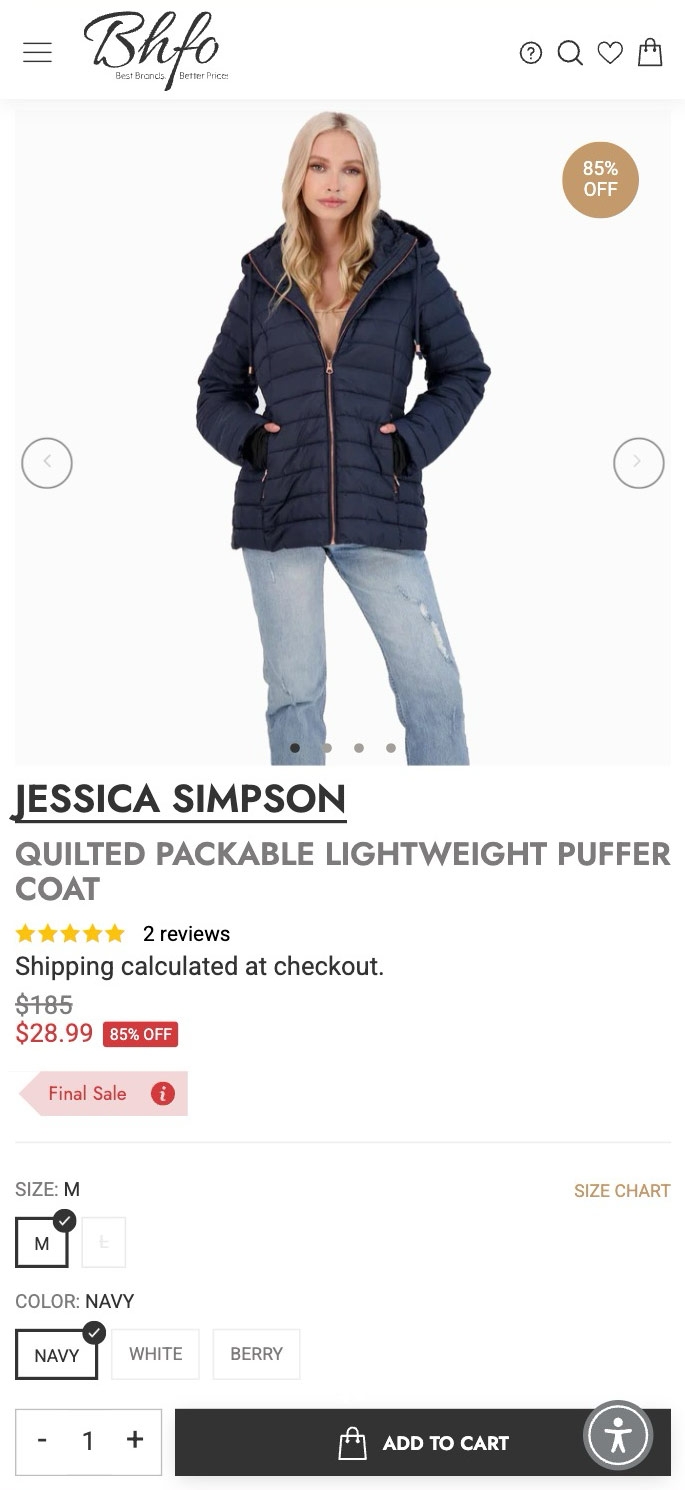
Smart Size Chart
Enhanced size chart ensures global users easily identify the product size needed, as well as being able to choose the size on the informational chart as well.
Improved Mobile Experience
The mobile experience was significantly enhanced by optimizing navigation and responsiveness, ensuring a smooth and engaging user interface across all mobile devices.

MAKE IT HAPPEN