


What Does a Mobile-First Approach Mean and How Do You Accomplish It?
Taking a mobile-first approach is pretty straightforward, and is exactly what it sounds like. Designing for the smallest screen first and then working your way up to the largest – mobile, tablet, and then desktop. Unlike the idea of focusing on building a website for the most advanced browsers first, this approach, also known as Progressive Enhancement, is a strategy that focuses on building a site focused on content.
To learn more about what it means to take a mobile-first approach and how to accomplish it, we spoke with Alain Garcia and Serghei Grab, UI/UX Designers at Absolute Web.

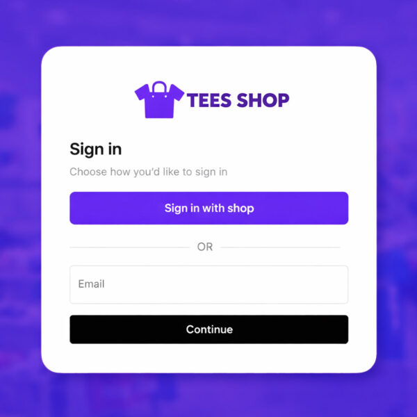
Courtesy of UXPin
Q: What does a mobile-first approach really mean?
Alain: Contrary to the popular practice of designing the desktop version of a website first, taking a mobile-first approach is designing with your mobile users in mind, and then scaling it up to desktop dimensions. This practice is used to better understand and analyze mobile behaviors, adapting and improving the experience for better user usability and site outcomes.
Serghei: Taking a mobile-first approach is a new design strategy that starts with mobile users and works with their needs and goals. It needs to revolve around users to increase engagement and conversions on a website, web store, or application. Mobile interfaces have to be responsive for all types of devices, which is why eCommerce is moving from desktop to smartphones, and even smart watches, allowing customers to make sales in the most convenient way.
Q: How do you accomplish it?
Alain: This process starts by analyzing your desktop and mobile traffic. If the interactions with your brand are higher on mobile devices (which is almost 100% accurate for 2021), this approach will benefit your brand and boost the user experience on your site. At the end of the day, this will result in higher conversion rates across your site.
Serghei: However, the mobile-first design has one major drawback – the limited ability to place content. Designers should carefully adjust the amount of content to the narrow frames of mobile screens and make information more accessible to users. Everything begins with wireframes. Their importance of a mobile-first design is similar to a blueprint when we construct brand new buildings.
Leave minimal elements on the web page and remove everything the user is not interested in. Most people use their phone with one hand and designers have to keep in mind that all call-to-actions, and all important elements, should be placed in an easily accessible area on a screen. Don’t make elements too small, because we touch screens with our thumbs which requires a large area.
When looking to take a mobile-first approach, working with an experienced designer can be helpful, especially when your goal is to increase the mobile conversion rate for your online store. Focusing first on content and its placement is an effective way to tailor your online experience to your customers, who spend more time shopping on mobile than desktop.
Interested in working with Absolute Web?
Learn more about our experience, brands we work with, or contact us today!

More Articles
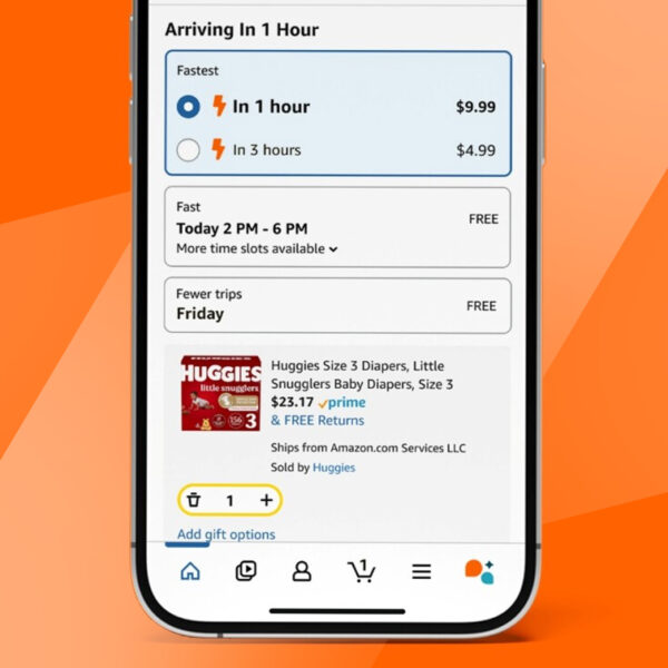
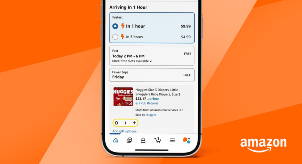
Amazon Is Rewriting Delivery Expectations. Again. Ecommerce ...
Amazon just raised the bar again. With the rollout of…
Read more

ChatGPT 5.4 and “Thinking Mode”: What Ecommerce ...
OpenAI recently introduced GPT-5.4, the latest upgrade powering ChatGPT and…
Read more
Shopify Deprecates Legacy Customer Accounts. Here’s What ...
Shopify has officially marked Legacy Customer Accounts as deprecated. This…
Read more
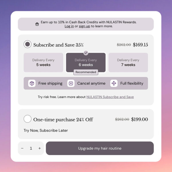
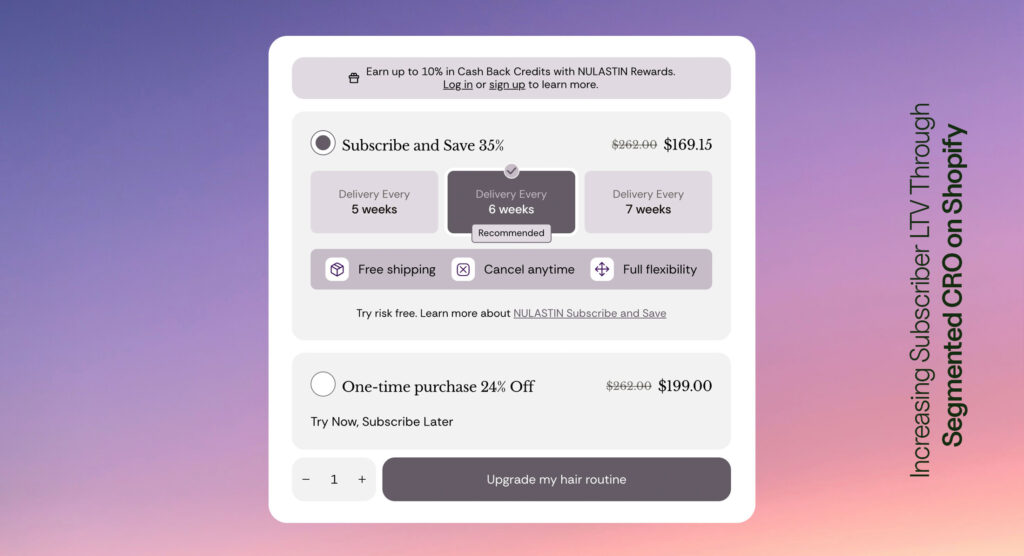
How Strategic CRO Helped Nulastin Increase Subscriber ...
Subscription brands don’t win by chasing one-time conversions. They win…
Read more

EEE Miami 2026: The Conference That’s Redefining ...
If you’ve been in ecommerce long enough, you know most…
Read more

How Subscription Data Is Powering the Next ...
Ecommerce UX has traditionally been built around a single moment:…
Read more

Top 20 Shopify Winter ’26 Updates Every ...
Our strategic take on the most important changes from Shopify’s…
Read more

ChatGPT Shopping Research: What It Means for ...
OpenAI just released ChatGPT Shopping Research, and it’s quietly becoming…
Read more
Social Feed